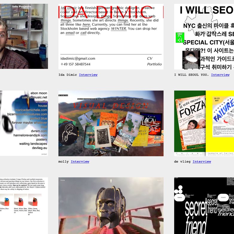
If you grew up in the ‘90s, you probably remember a lot of edgy graphic design. Back then, the Wipeout video game series was a gateway drug that introduced me to The Designers Republic. I remember the Future Sound of London’s site being one of the earliest rich media experiences I saw on the web, an angsty and foreboding experience that was just as much an expression of social disconnection as the group’s seminal 1996 album, Dead Cities.
When Radiohead released A Moon Shaped Pool to the public, the album’s website filled me with nostolgia. There it was, in all caps: “RADIOHEAD”. In every variation of Radiohead’s logo, I always felt like it had a particularly hideous capital A. This new site was the real deal. Back in the day, in order to get such ugly, unsettling-looking typography onto a website, we had to resort to using a gif, or a Flash movie. But now, in 2016, we can reproduce that angsty look with embeddable web type. Hooray for progress!
A web design gallery receives mainstream media coverage for being so ugly
When I read the Washington Post’s recent article on “Brutalist Web Design”, however, the nostalgia train came to a halt. The piece, covering brutalistwebsites.com, drew obvious comparisons with the popular architectural style of the 1970s, and pointed out that some brutalist-looking sites have always been popular. Reading through the piece, and some of the comments, I was surprised how many people acted shocked that anyone would intentionally make something ugly.
“This is web art not web design”, one commenter said.
“Congratulations on making your philosophical point, you design rebels, you”, said another.
These two comments make some valid observations, but I think under a lens of constructive criticism, a designer can take these points further. I think a designer should look at these sites constructively. Pointing to a problem without offering a solution is also known as whining. A designer’s job isn’t to whine about bad design, our job is to make it better.
I’m sharing this because I’ve participated in some conversations in the past year that left me with the impression that a lot of people don’t keep this in mind, when they talk about design.
To connect to an emotion, a design must feel authentic to its audience
The first comment I quoted makes a fair point. If all creative work rests somewhere in a continuum between form and function, these brutalists sites lean more in favor of form than function. Having said that, people who work with design every day shouldn’t be shocked at an intentionally unattractive design. There are plenty of valid reasons, which often aren’t strictly philosophical.
One example: Brands need to feel authentic to connect with audiences.
While I haven’t seen any brand guidelines for Radiohead, I feel like I can guess some of the themes they want to evoke. Anyone should be able to look at a Radiohead album cover, and be able to tell it isn’t music popular people like. Radiohead’s music connects to people who’ve never felt popular. Or maybe it’s the one thing that connects with the popular people when they have a bad day. But in order to discover the music, it helps them to see in advance how edgy and distraught the music will be.
An album full of upbeat party tunes should come with album artwork conveying that feeling. If the music is so upbeat that it feels manufactured and insincere, the graphic designer can let those words guide their work.
The process of choosing words to guide the direction of a project is often covered by design principles.
Design principles clarify the otherwise murky waters of a project’s creative objectives
As designers, our job is to understand which visuals evoke which emotions. It’s helpful to make sure a project’s stakeholders agree about which emotions they want to convey, and share some consensus of how. Mood boards can help you ask questions, like, “What do you like about this particular design? What feeling do you get from looking at it, and why do you think it affects you that way?” After everyone gets their cards on the table, you are in a much better position to steer the project in the best direction.
Without having that conversation, different stakeholders often have different visions for a project, resulting in them sending you mixed signals. This gives you a false-start, and wastes precious budgeted time.
Design is subjective, in a vacuum. By establishing an agreed-upon context for creative decision making, you can help remove a layer of subjectivity. Do not create an edgy looking design because you think it looks cool. That drags your project back down into subjectivity.
Design principles aren’t just for stakeholders, they’re there for you, too
Even if your stakeholders couldn’t be bothered with design principles, at least set them up for you. Ask yourself questions, like, “No, seriously, what emotion really speaks to the heart of this project?” Give yourself some space to develop a theory about why you want to evoke that emotion. Go nuts, create a design persona.
I’m obsessed with music, so I ask myself questions like, “If this site had its own personality, what music would it like? What songs connect with it differently than with me? Why is that?”
After pondering these questions, foundational steps like choosing typefaces, or defining a color palette, will have a greater sense of purpose, and intent. I have one less voice in my head, saying, “Well, maybe you should try one more thing?”
It gets me one critical step closer to done.
