Employer
Design Team
- Webmaster and UI Specialist (me)
- Senior Web Developer
- Team Manager
- IT Department Director
What I did
- Wireframes
- Visual Design
- HTML/SCSS/PHP
What I used
- Photoshop
- 3x5 notecards
- Atom
The Problem
In summer of 2015, plans were underway to replace Bloomington, Indiana’s main highway with an Interstate.
The paperwork required to officially close city roads creates a treasure trove of road closure data at City Hall. Our goal on the front-end of inRoads was to help drivers save time and frustration by presenting our data in a familiar, approachable way—with a map.
Project Requirements
- Using a map, show users where roads and other public spaces were scheduled to close.
- Show users why the closure will happen, like road construction, power line maintenance, parades, or races.
- Let users control how much information they see, by limiting results to certain dates or to certain types of closures.
- Let users toggle between a map and a text-only view.
Joining a project in progress
Development on this app began before I joined the team. When I saw it on the development server for the first time, it was confusing.
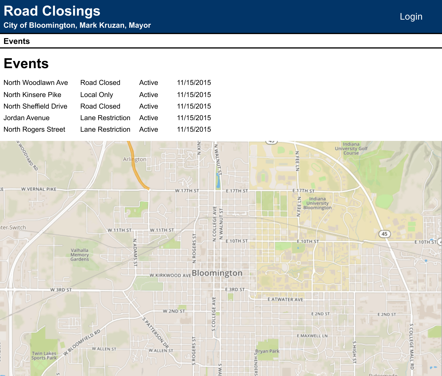
I was tasked with applying a little visual polish to this UI.
I identified two opportunities for improvement:
Visual Hierarchy
- Screen real estate allocated to the listing of “Events” was disproportionate to the value offered by the map.
- Incorrectly allocating screen real estate resulted in pushing the most valuable element out of initial view.
Two scrolling elements were layered on top of each other
- Placing the map inside block of scrollable content set users up to accidentally zoom the map out.
- We could prevent these accidents by separating the block of scrollable content from the map.
Balancing the need to redesign with the need to ship new features—fast
The stakeholders wanted to see mockups showing solutions for the two problems above. However, they didn’t want to delay new features to address the problems, so my deliverables for the next meeting needed to handle both fixing the old and adding the new:
- Make the map the central visual point of interest.
- Separate the listing and the map into two distinct areas.
- Add an ability to filter closures to a date range, and an option to show a text-only mode.
- Integrate updated branding and identity from an ongoing, citywide website redesign project.
- Stakeholders needed to feel like development wasn’t being “held up” by efforts to stem design debt.
Instead of low-fidelity wireframes, mixed-fidelity wireframes offered a “best of both worlds” approach: I could iterate rapidly, and the rest of the team could see their previous work had not been discarded.
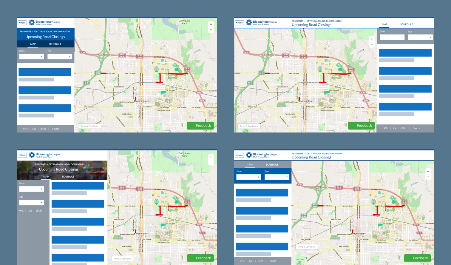
These mixed-fidelity wireframes enabled me to engage with stakeholders about the visual hierarchy for existing features, and new features to be added in the next sprint.
In the next team meeting, we built consensus on each question. Our key decisions were:
- We agreed to a visual workflow moving from left to right. Users would (A) choose filters, (B) browse the list returned by the filters, and (C) click a closure to highlight it on the map.
- The wireframes didn’t include a way to limit results to certain closure types. With six different types, it made sense to list them vertically on the left. We dedicated a left panel to filtering UI.
- We added the title, “inRoads,” and breadcrumbs to help tie inRoads in to the rest of the City’s online presence.
- We placed the toggle between the map and text-only mode in a bar that tied the listings and the map together, because the toggle affected everything in the UI after the filters.
By the end of the meeting, we had synthesized the wireframes into one whiteboard drawing showing what ideas we had consensus on.
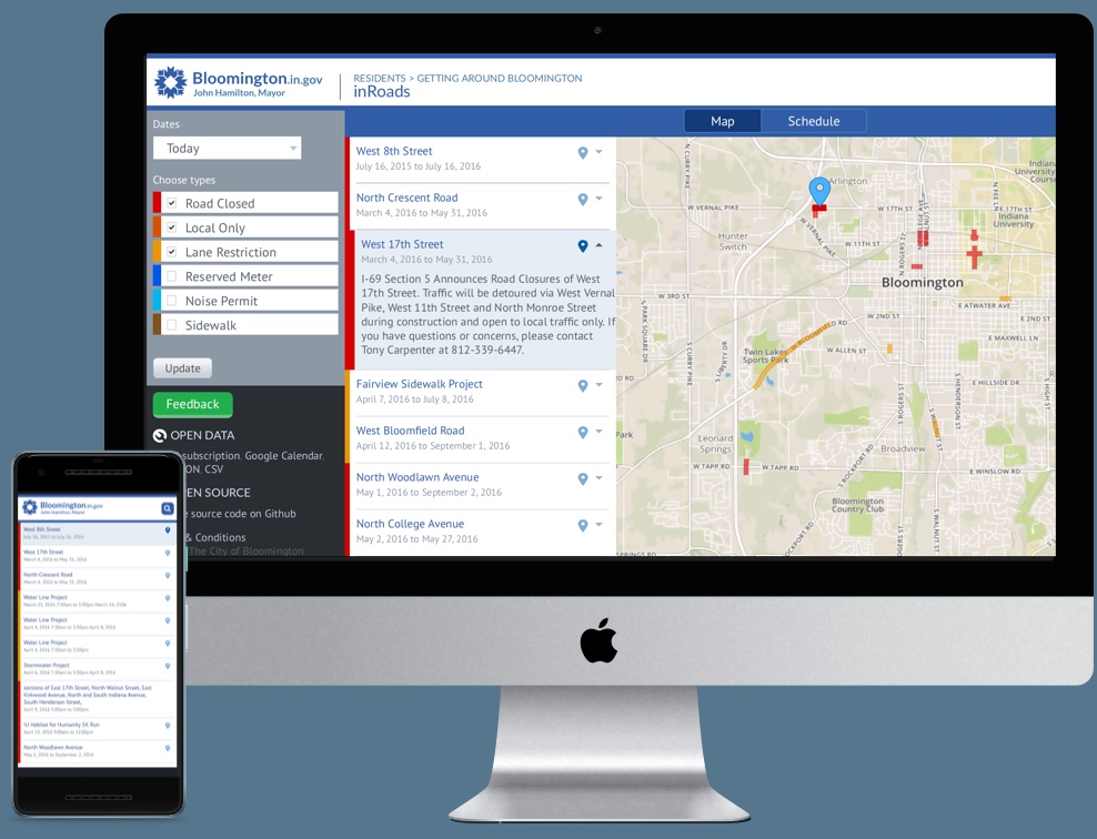
After this conversation, the team felt confident about moving forward without a high fidelity mockup. I was both designer and developer, so I made high-fidelity design choices directly in code. After a few rounds of visual polish, we launched a public beta.
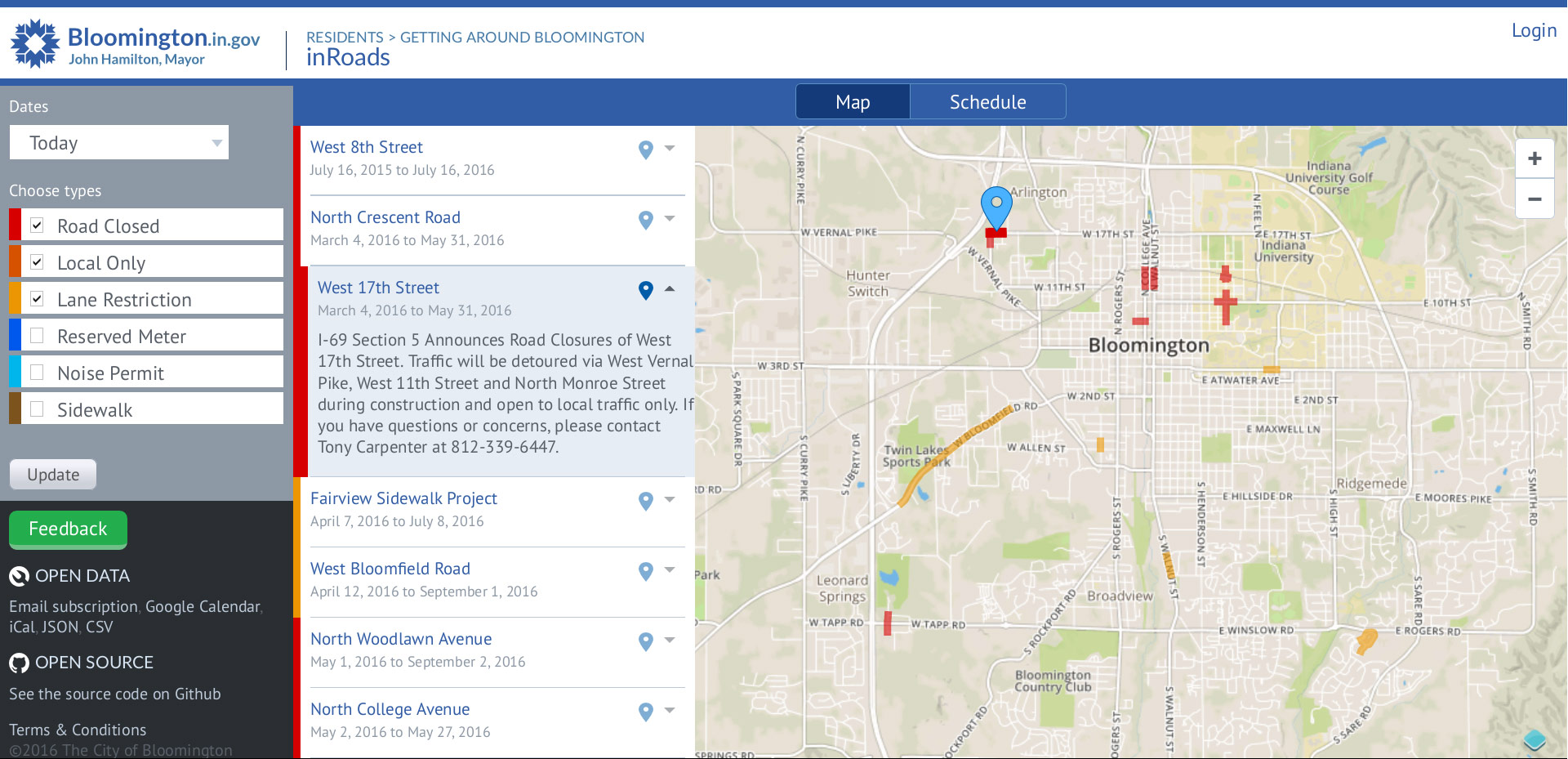
What inRoads looked like when we launched the first public beta.
A pivot to responsive design
I grew increasingly concerned about mobile users. Stakeholders believed it wasn’t a use case and my team believed that it was physically impossible to display this much data on a smaller screen.
In my downtime, I sketched some ideas of how to make it work on 3x5 notecards.
When we launched the public beta, a local accessibility and information architecture specialist @-tweeted screenshots of inRoads on her iPhone to the IT Department Director.
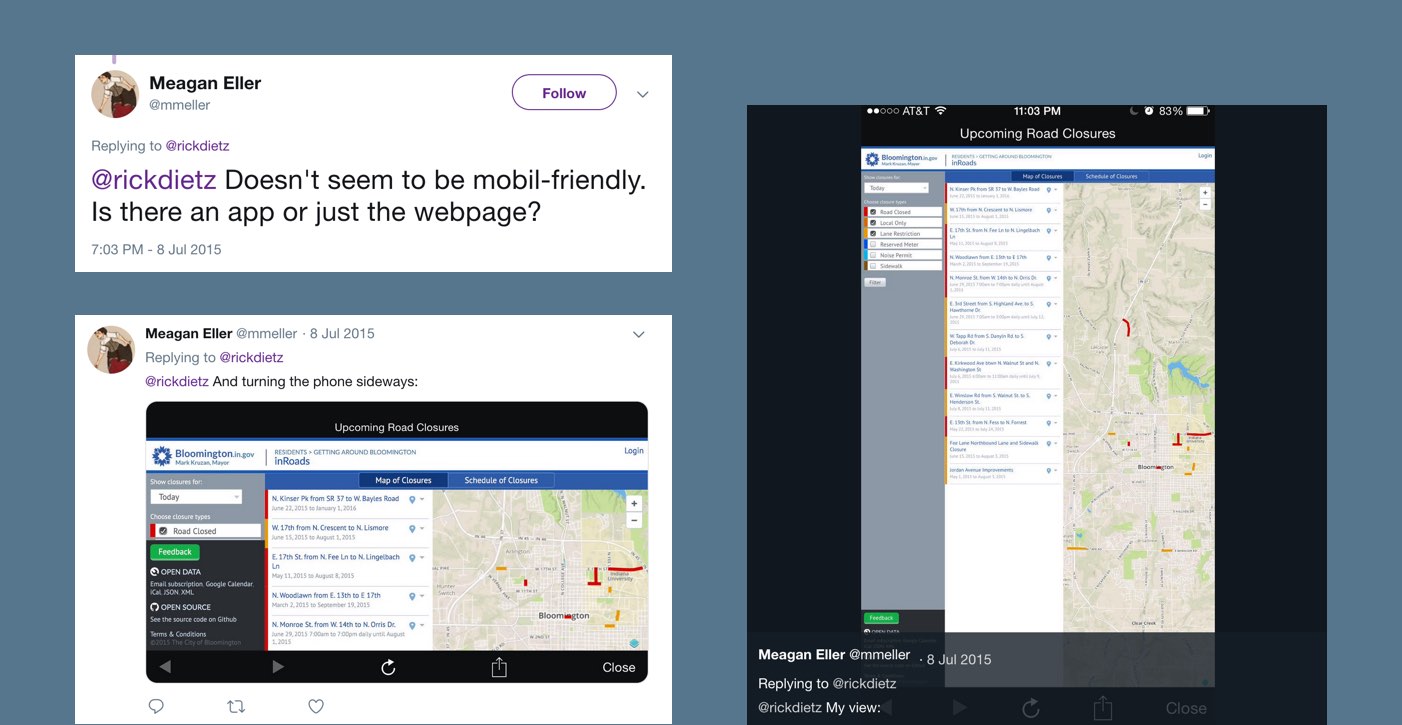
Public feedback we received about inRoads on Twitter. (Source)
At our next team meeting, the tone was somber. With awkward hesitation, the Department Director asked: “Can we… make this… work on mobile?”
“I have some ideas I’ve already sketched on notecards at my desk. I can bring them right now,” I replied.
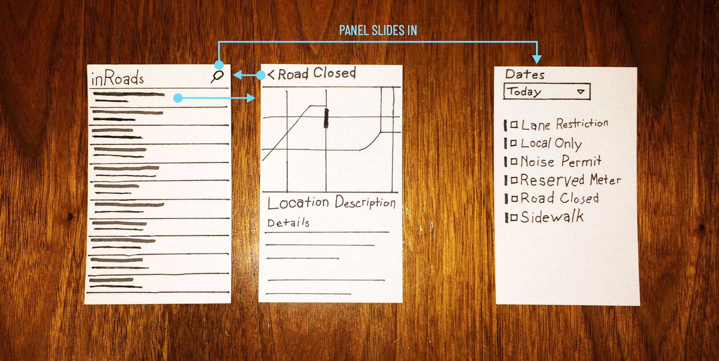
The notecards that helped me pitch responsive web design for inRoads.
Left: The default view showed a listing of road closures. Center: Tapping on a road closure would take users to a detail view for that closure. Right: Filters would become a panel that came in from off-canvas when users tapped the search icon.
I explained how these cards took the components we had already shipped and broke them down into smaller pieces that displayed one at a time. I slid the cards in and out of position on the desk, to illustrate how users would get from one view to the next.
The rest of the team believed this would take weeks to implement, and that amount of time wasn’t worth the effort. I counter-offered to build a rough prototype in one day, and if we agreed that the idea at least worked, I would spend a few more days on visual polish and animations.
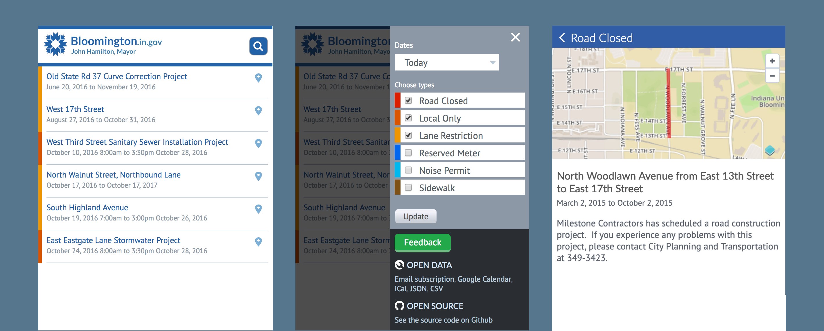
The three main UI states for inRoads on a phone.
Left: Listing of closings. Center: Filter controls. Right: Detail view for an individual road closing.
Results
inRoads won a Code For America Technology Award, for putting government data in the hands of the citizens who need it.
Media coverage caused spikes in engagement, but traffic tended to settle at around 20–25 unique users per day. We didn’t have user engagement goals, but everyone agreed that this was a big improvement over the mailing list that came before it.
What I learned
A desktop UI can be composed of several mobile UI components. Product teams with limited responsive design experience are often anxious about the extra effort required to make the same UI work on different screens. I was able to help my team work through its anxiety by identifying the activity associated with each component on the desktop UI, and imagining what it might look like to focus on one activity at a time.
Ask deeper questions about the value of the product. Technologist Tim O’Reilly wrote that the most exciting thing about inRoads is that it publishes a JSON feed of our road closure data, which could be used by other apps. In the future envisioned by O’Reilly, the visual interface I designed will be completely unnecessary, because the data feeds will report road closures directly to apps like Google Maps and Waze. As a junior designer, I jumped at every opportunity to design something. As a senior designer, I see it as my responsibility to ask more questions about value, and ensure that my work fulfills a legitimate need.
What I would do differently if I did it again
Modern prototyping tools. My team would not have been convinced a responsive redesign was possible unless both the desktop and mobile designs used the same components. Since this project shipped, apps like Sketch, Figma, and Adobe XD have made it easy for designers to componentize our designs. If I face a challenge like this again, I would use the same components in the mobile artboard as in the desktop artboard, to communicate that individual components would still be implemented with the same pieces of code.
Holistic project requirements and goals. Analytics data on click events could inform what features to focus on, or whether to continue working on the project. Additionally, I would recommend the city test the app’s effectiveness by conducting targeted traffic studies, and looking at correlations between traffic congestion, volume of road closures, and engagement with the app.
Guerilla user research. Pivoting to support mobile after shipping a semi-polished beta could have been costly. Responding to feedback on Twitter is better than ignoring it, but it would have been better to establish an external feedback loop before shipping production code. I would recruit concerned citizens to meet up for coffee, conduct interviews, and potentially measure their reactions to an interactive prototype. Making that investment up front can help prevent difficult last minute decisions about overtime versus corner cutting.