Employer
Design Team
- Webmaster and UI Specialist (me)
- Senior Web Developer
- Team Manager
- IT Department Director
What I did
- User Interviews
- Interaction Design
- HTML, CSS, JavaScript
What I used
- Pen and paper
- Atom
The Problem
The City of Bloomington notified the public about scheduled road closures via a weekly email that was manually typed, by hand, by one person. For this story, I’ll refer to her as Jean.
It was an overwhelming task, and it was about to get worse: Looming plans to tear up Bloomington’s main highway and rebuild it as an Interstate promised even more road closures to type up.
Research
The developer and I interviewed Jean at her office, and she walked us through her process.
Jean received information about road closures through email. She copied and pasted bits and pieces of each email, tediously re-formatting each new piece, until she had a pristine, polished email—ready to send.
She started this process every Friday morning, making her completely unavailable for anything else until she was finished—usually close to the 3:00 PM deadline. Even family emergencies had to be placed on hold for this work.
Project requirements
Only one person was planned to use this back end, so we were required to build it as lean as possible.
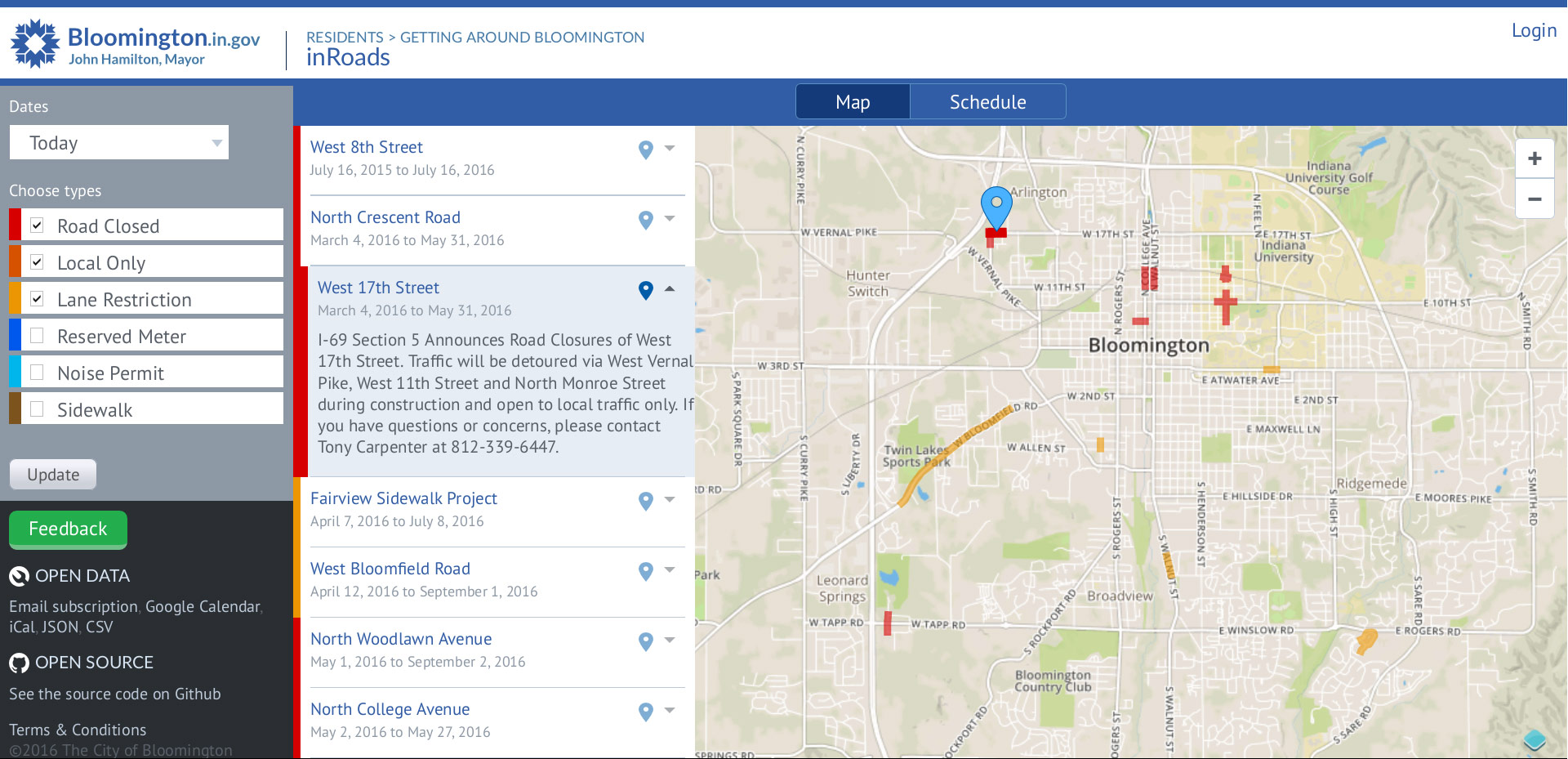
The front end of inRoads. To keep design and development lean on the back end, we repurposed design patterns and code from the front end.
Using the front end as a starting point, our goal was to eliminate the manual formatting overhead in Jean’s process.
- We designed a web form that captured the information necessary to convey where, when, and why a road closure was scheduled to occur.
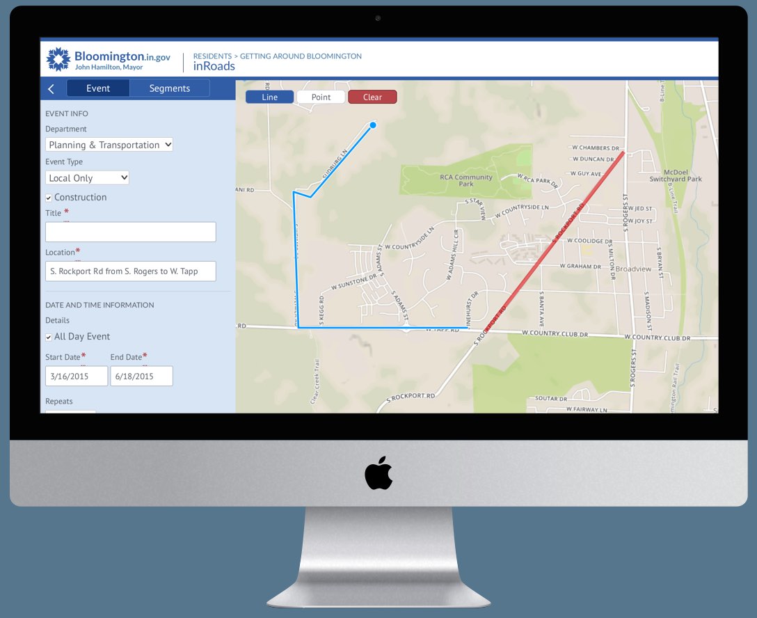
- We created a web-based drawing tool that allowed Jean to trace the shape of the closure on a map.
- The app would automatically compose the weekly road closures email and send it to the mailing list every Friday at 3:00 PM.
Iterating the interaction design for a simple drawing tool
The drawing tool had three functions: Drawing a line, drawing a point, and deleting the drawing to start over. The developer chose to use the OpenLayers library for this interface, built a prototype, and asked for my design input.
First iteration
- The interface launched in line drawing mode.
- A user would start a line by clicking on the map to create a start point.
- Following clicks would add a new point, until a user clicked on an existing point to disengage drawing that line.
When I tested the interface, I frequently accidentally drew the first line, even though I intended to drag the map to the area that I wanted to draw in.
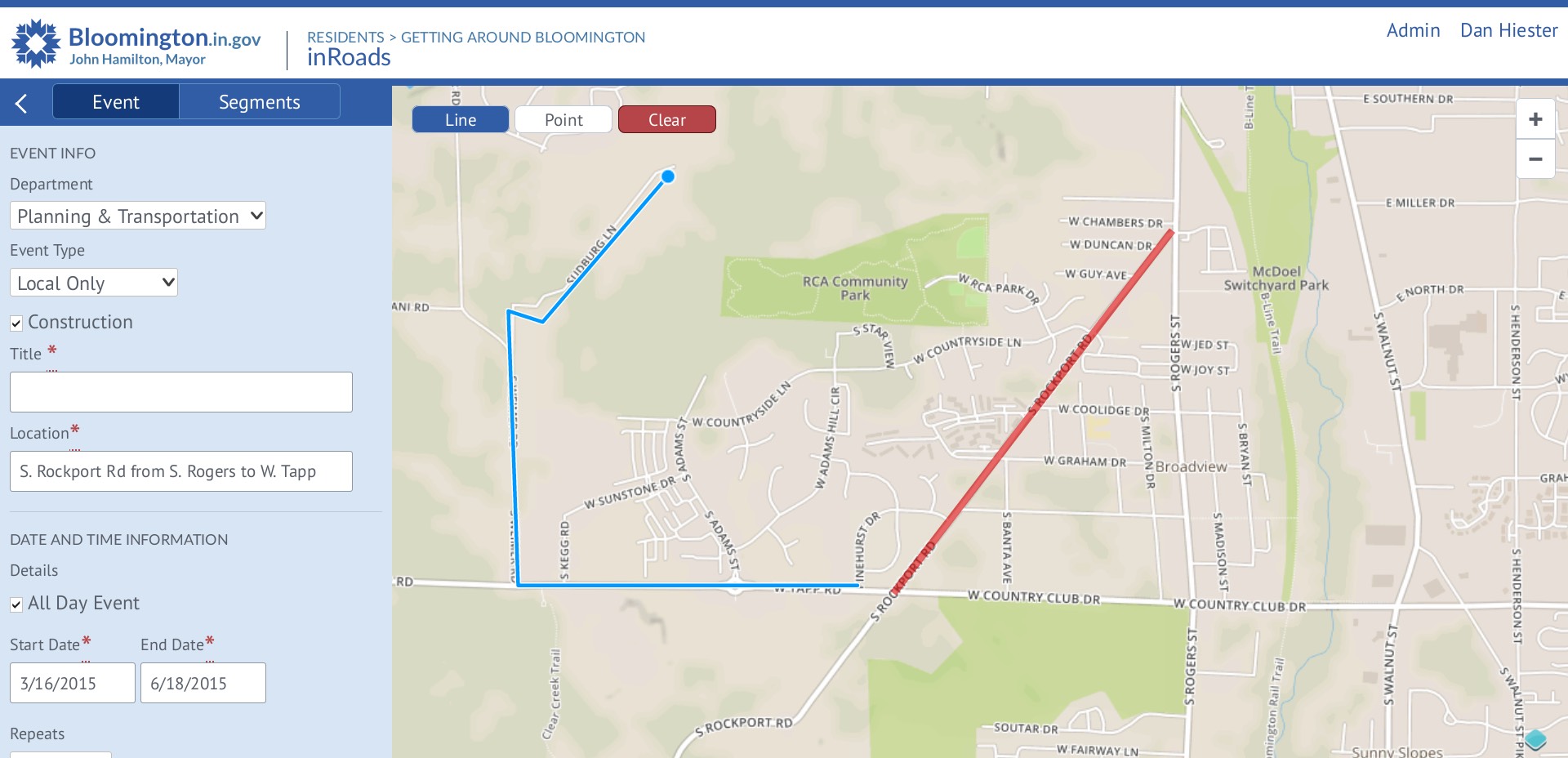
The back end of inRoads, designed and implemented mostly from components repurposed from the front end.
Second iteration
- For the second iteration, the interface launched in map dragging mode, instead of line drawing mode. This was critical, because it allowed users to zoom and drag to the specific part of the map they wanted to draw on.
Results
After we shipped the first release of inRoads, the developer and I returned to Jean’s office to interview her about the app, and how it changed her process.
Jean was very happy with the outcome. inRoads lifted a huge weight off her shoulders.
Because there was no risk of accidentally sending an email early, Jean didn’t have to wait until Friday morning to get started. She was able to copy each piece of road closure information as soon as it arrived in her email. This completely cleared up her Friday schedule.
Even though drawing the road closing on the map increased the overall amount of information Jean entered, the web form was so much more efficient, that she achieved dramatically more output in less time.
She told us that she joked with her coworkers: “If you have a really big problem, just have the IT guys make an app for you. It’s that easy!”
What I learned
Believe the hype about including user interviews in the design process. Watching Jean work through her process gave me a natural, intuitive understanding of the problem. Talking with her revealed personal details about how her old workflow led to problems at the office, and outside the office. I couldn’t have known about that if a supervisor had written me a design brief. The time investment was small, but the return on that investment was huge.
Let users choose their activity—don’t choose for them. We were excited to add drawing functionality to our web app—so excited, we jumped to conclusions that it made sense for Jean (or any user, for that matter) to start drawing right away. But in testing, we found that in order to draw, a user first needs to zoom in on the part of the map they want to draw on. It was critical to let the user make the decision about when they are ready to begin drawing.